About Screens
I build and maintain Diligence, a SwiftUI about screen library for macOS and iOS. While working on the macOS implementation, I looked at a lot of about screens. There’s real variety out there and some truly creative designs, so I thought I’d showcase a few here.
Apple
Many of Apple’s apps use the standard macOS about view, as seen here in Mail and Books, but even Apple are not without variety—Music, Xcode, Simulator, and even Finder all do something a little different.


Books

Music—that icon’s a bit too big

Xcode—balanced with clear action buttons
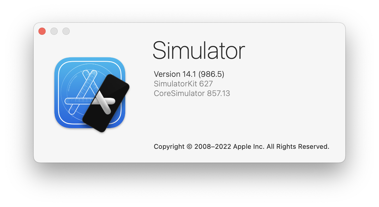
Simulator—curious typography choices
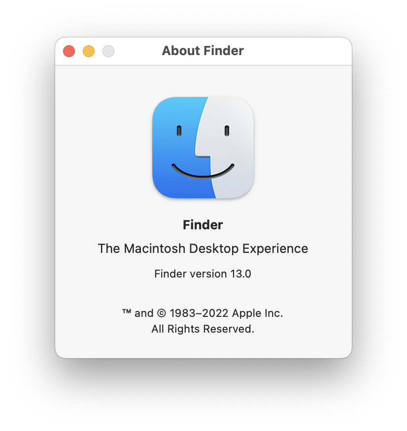
Finder—'The Macintosh Desktop Experience'
Panic
Long-time Mac developers Panic (and creators of the charming Playdate) have no shortage of personality in their about screens.
The inclusion of the two-tone Panic logo really helps bring a consistency across the apps. Even Transmit—one of their oldest apps—makes room in a standard macOS about screen for this. (I’d love to see it in Playdate Simulator too.)
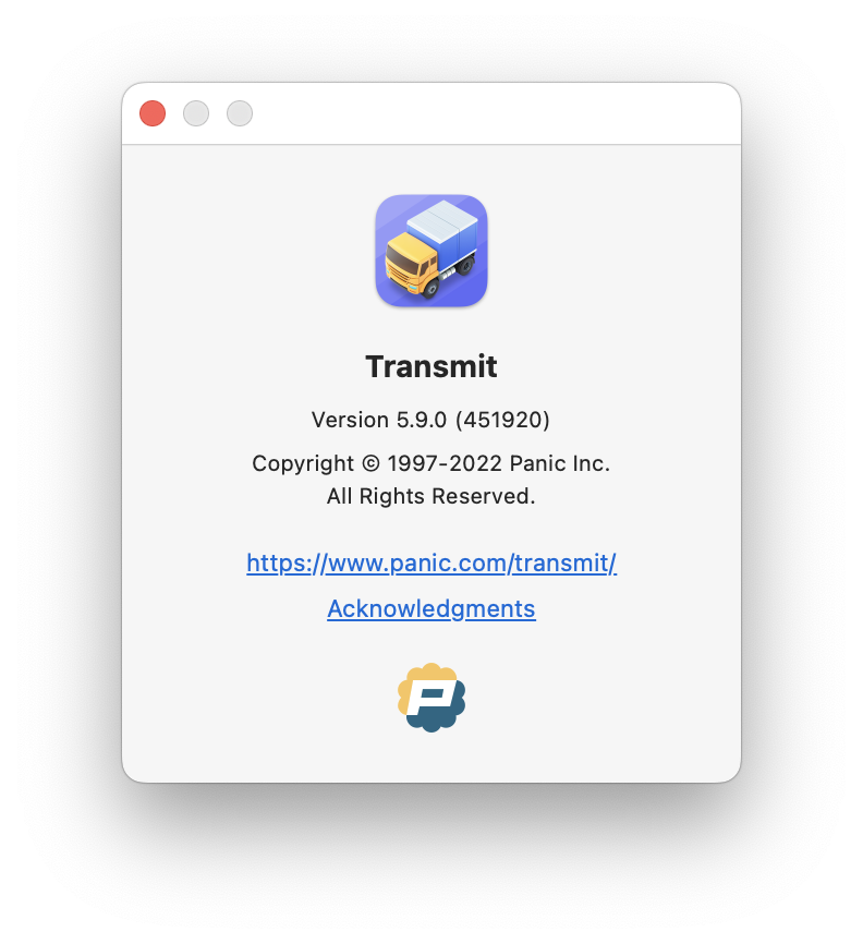
Transmit—a standard macOS about screen with a clear Panic identity

Nova—information-rich with icons marking the different sections

The about screen respects Nova’s glorious themes

Playdate Simulator—desperately in need of a crank
The Iconfactory
The Iconfactory’s apps offer some pretty great and clean about screens, but I’d love to see a little more consistent identity across the apps. Twitterrific’s about screen is perhaps one of my all time favourites—truly standout with a great balance of whimsy and function.

xScope—simple and well structured
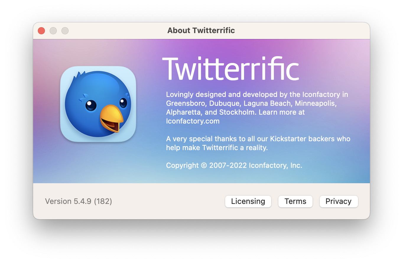
Twitterrific—comprehensive, clear, …
… and full of easter eggs
Tapbots
Tapbots have always had a beautiful, and consistent robot aesthetic. This manifests in their icons meaning that, with little else, their about screens feel incredibly uniform.
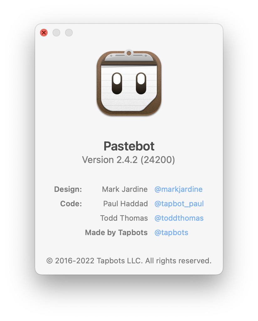
Pastebot—a clean tabular layout showcasing the app icon
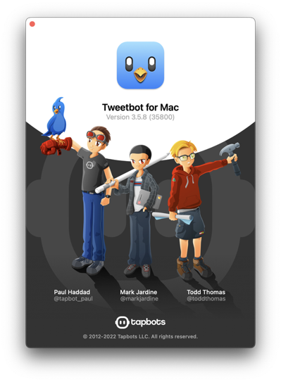
Tweetbot—quite literally a work of art
Misc.
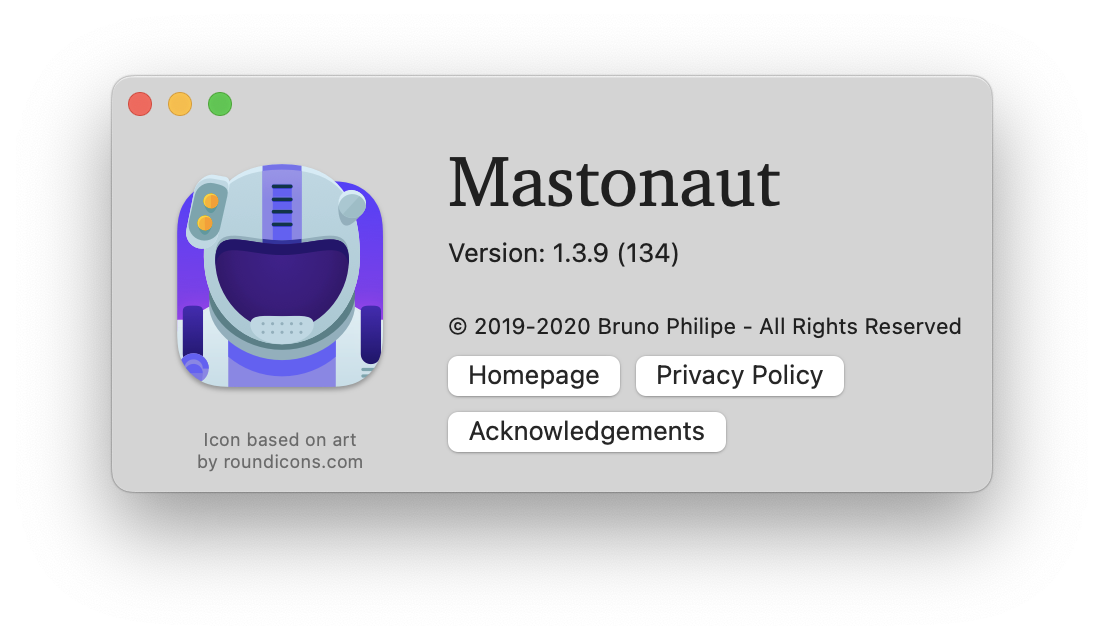
Mastonaut—the icon button layout feels a little unbalanced but is incredibly practical
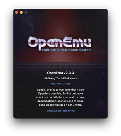
OpenEmu—leaning into that 80s aesthetic

NetNewsWire—trust Brent Simmons to use the classic RTF-based Mac about screen
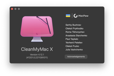
CleanMyMac X—clear corporate branding and scrolling credits
CleanMyMac X—a little squashed but featuring a wonderful animated icon